
Challenge
The brand was entering a crowded space with no visual equity and needed to look credible immediately.
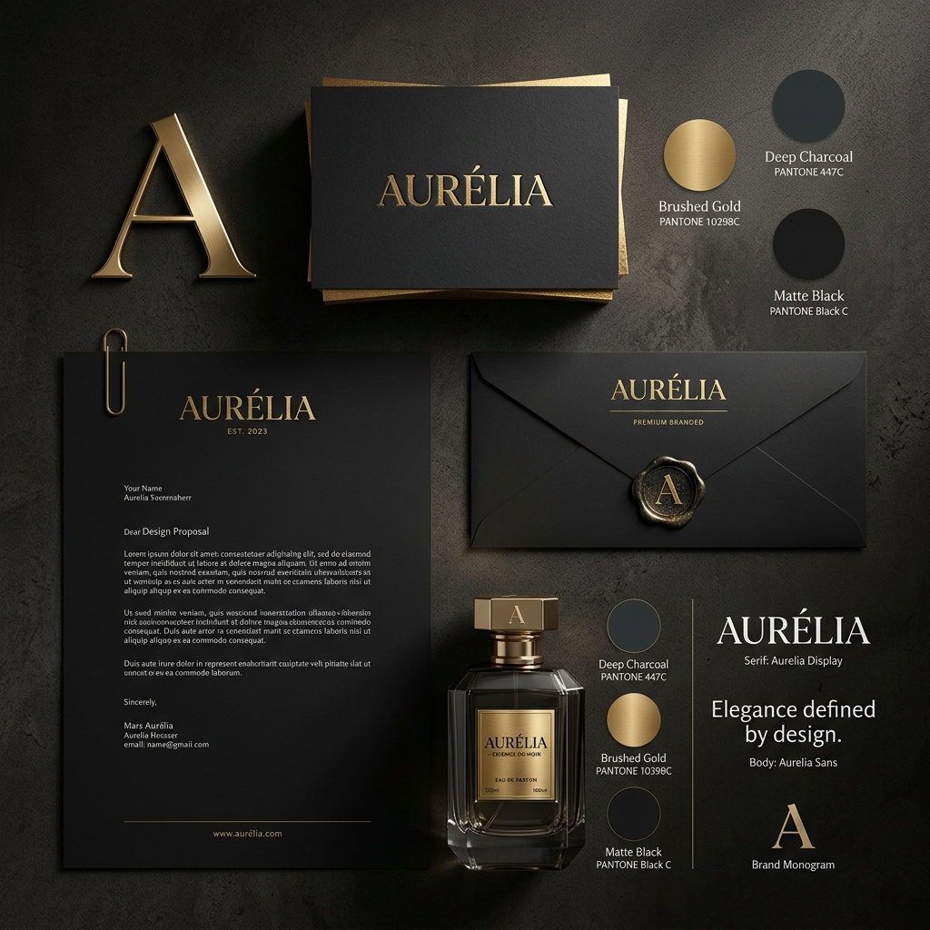
Branding
Oak & Grain needed a brand system with enough character to feel memorable but enough discipline to scale across channels without getting noisy.
Project snapshot
Client
Oak & Grain (Branding)
Timeline
3 weeks
Headline result
Launch-ready visual system
28
Primary brand assets
Ready in 3 weeks
Launch toolkit
12 templates
Social system
Challenge
The brand was entering a crowded space with no visual equity and needed to look credible immediately.
Approach
We built a tile-inspired identity, expressive typography rules and a content-ready asset kit that kept the brand consistent without feeling rigid.
Outcome
The business launched with a cohesive premium presence and a system the internal team could actually use day to day.
Next move
Tessera Studio combines strategy, front-end polish and growth thinking so the final system looks premium and performs like it means it.